Nothing discussed herein should be taken as investment advice or as a recommendation regarding any particular investment vehicle or course of action. All statements herein are statements of subjective opinion and for information and entertainment purposes only. Seek a duly licensed professional for investment advice.
While writing yesterday’s post on the idea of selling the inauguration, I noticed that the behavior of S&P500 around President Obama’s election in 2008 was highly positively correlated with its behavior around the first time President Bush was elected in 2000. This is not something I had expected a priori, so I decided to take a closer look.
Sticking with the basic features of the MarketWatch article, I’ll restrict myself to the presidential elections since 1950 where the party holding the White House changed: 1952 (Eisenhower), 1960 (Kennedy), 1968 (Nixon), 1976 (Carter), 1980 (Reagan), 1992 (Clinton), 2000 (Bush), and 2008 (Obama). I will be looking at S&P 500 levels relative to election day performance over the period 100 days before the election to 100 days after the election.
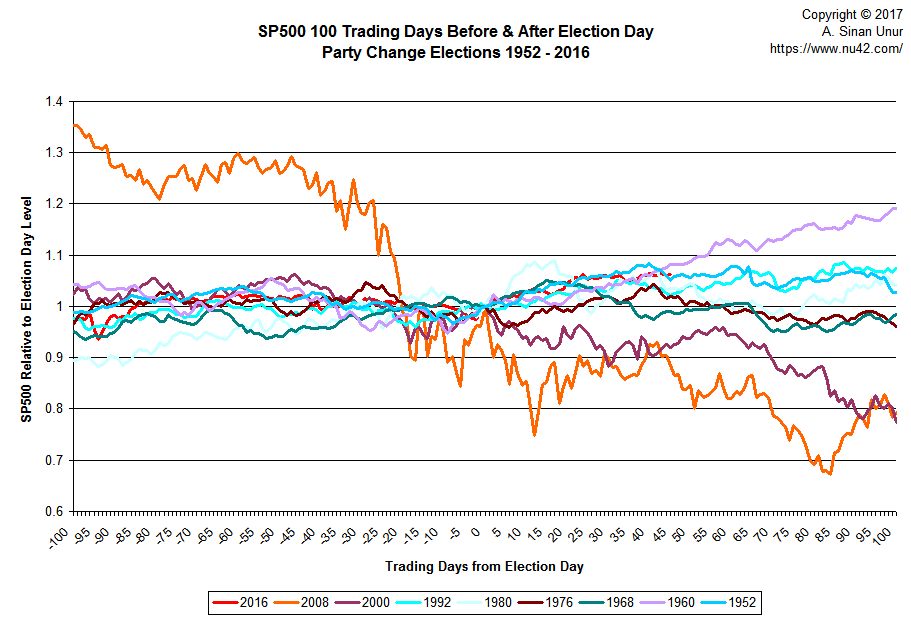
To refresh your memory, here’s what things look like if you plot each 201-point series on the same chart:
Clearly, there is a lot of clutter there. One can “identify” some patterns by squinting hard this or that way, but that’s rather subjective and error-prone. So, let’s try to reduce the variability to its essential components.
Take out your favorite Stats tool, and run a simple Principal Components on the eight variables (I’ll be using Stata):
. pca obama bush clinton reagan carter nixon kennedy eisenhower

Principal components/correlation                  Number of obs    =       201
                                                  Number of comp.  =         8
                                                  Trace            =         8
Rotation: (unrotated = principal)             Rho              =    1.0000

--------------------------------------------------------------------------
Component |   Eigenvalue   Difference         Proportion   Cumulative
-------------+------------------------------------------------------------
   Comp1  |      4.52593      2.92298             0.5657       0.5657
   Comp2  |      1.60295      .477661             0.2004       0.7661
   Comp3  |      1.12529      .798646             0.1407       0.9068
   Comp4  |      .326645       .14957             0.0408       0.9476
   Comp5  |      .177076     .0697737             0.0221       0.9697
   Comp6  |      .107302     .0200748             0.0134       0.9831
   Comp7  |     .0872271     .0396505             0.0109       0.9941
   Comp8  |     .0475765            .             0.0059       1.0000
--------------------------------------------------------------------------
Let’s look at what those components look like:
. predict pc1-pc8, score

Scoring coefficients
    sum of squares(column-loading) = 1

    ----------------------------------------------------------------------------------------------
        Variable |    Comp1     Comp2     Comp3     Comp4     Comp5     Comp6     Comp7     Comp8
    -------------+--------------------------------------------------------------------------------
           obama |  -0.4340   -0.1862    0.1284    0.1272    0.2261    0.1264    0.7981    0.2009
            bush |  -0.4345    0.0403    0.1023    0.3964    0.5330    0.1474   -0.5363    0.2205
         clinton |   0.4327   -0.1531    0.1615    0.1364    0.0452    0.8585    0.0211   -0.0717
          reagan |   0.3500    0.4276    0.0707   -0.4628    0.6420   -0.0594    0.1275    0.2086
          carter |  -0.1901    0.0409    0.8296   -0.3474   -0.2991    0.0386   -0.1445    0.2034
           nixon |   0.1406    0.7037    0.0618    0.5238   -0.3036   -0.0032    0.1584    0.2992
         kennedy |   0.3629   -0.4763   -0.0587    0.1013   -0.0546   -0.2049   -0.0640    0.7607
      eisenhower |   0.3543   -0.1835    0.4965    0.4342    0.2569   -0.4222    0.0933   -0.3909
    ----------------------------------------------------------------------------------------------
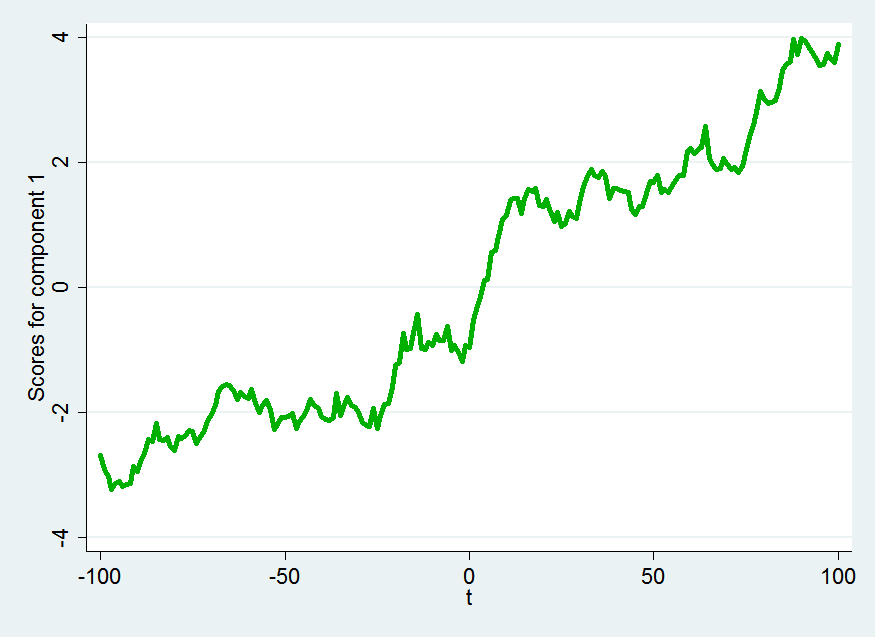
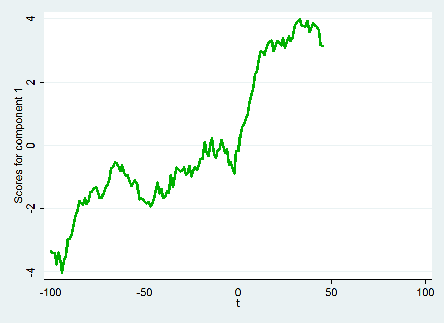
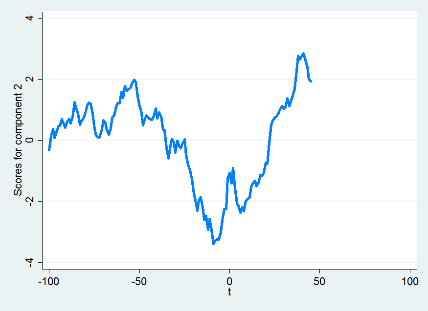
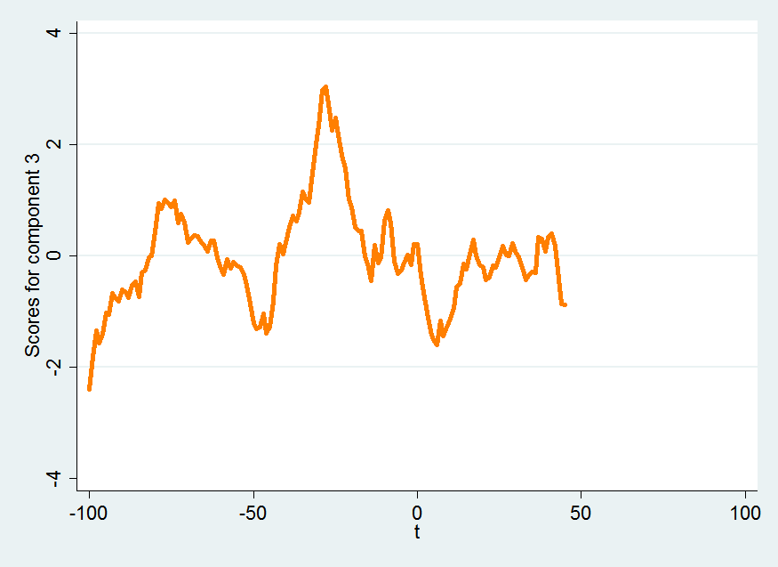
We can plot the first three principal components:
pc1
This component represent a steady rise in the index over the period 100 days before the election to 100 days after the election.
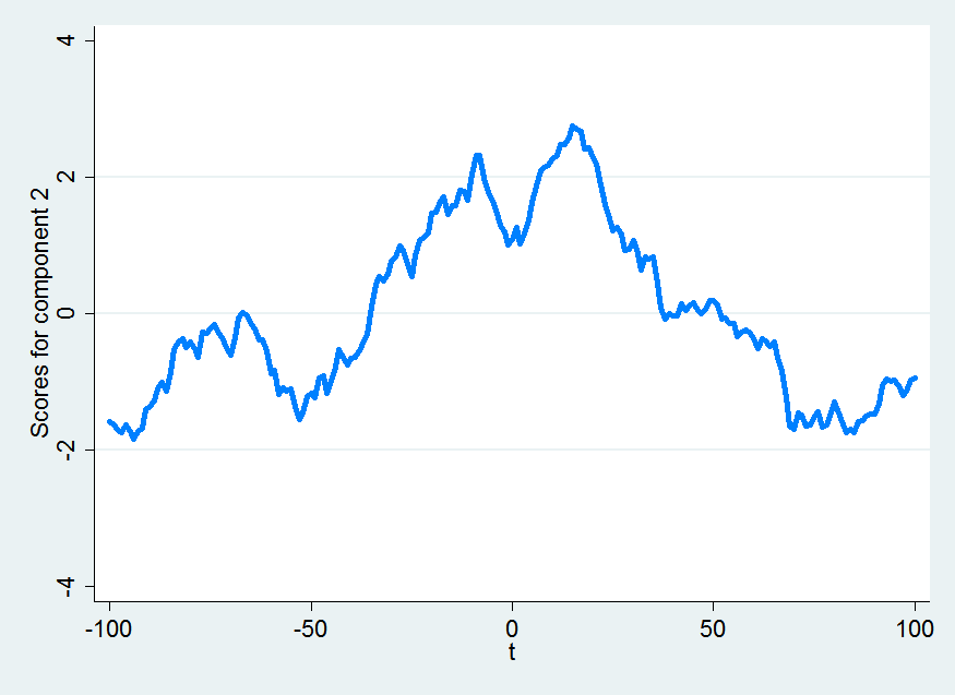
pc2
This component represents a volatile increase leading up to the day of the election, a dip on election day with a bump following the election and then a steady decline to pre-election levels, ending up on a slightly up-note.
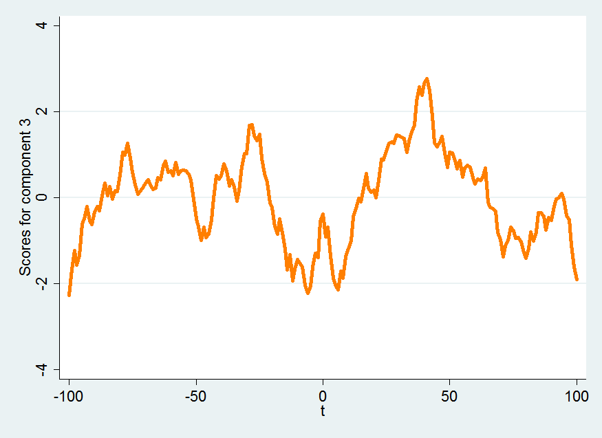
pc3
The third component represents a rocky road of generally higher index levels leading up to the election with an interesting local maximum on election day, followed by a nice post-election bump which disappears over the course of the following days and ends on a down note.
A combination of the patterns exhibited by the second and third principal components seems to be what most analysts have in mind when they talk about selling the inauguration. If we are in a world that corresponds to such a pattern, then the “Trump bump” has probably gone as high as it could, and will soon disappear.
The focus of this post is on identifying which elections exhibit similarity in the behavior of the stock market around them. To that end, let’s restrict our attention only to the first three principal components:
-----------------------------------------
  Variable |    Comp1     Comp2     Comp3
-----------+-----------------------------
     obama |  -0.4340   -0.1862    0.1284
      bush |  -0.4345    0.0403    0.1023
   clinton |   0.4327   -0.1531    0.1615
    reagan |   0.3500    0.4276    0.0707
    carter |  -0.1901    0.0409    0.8296
     nixon |   0.1406    0.7037    0.0618
   kennedy |   0.3629   -0.4763   -0.0587
eisenhower |   0.3543   -0.1835    0.4965
-----------------------------------------
What do those numbers mean? Let’s, for the sake of example, look at the coefficients for S&P 500 around President Obama’s election. The coefficients imply that we can approximate its behavior by combining approximately 3.4 parts steady decline (pc1), 1.5 parts pc2 decline with bump on election day and recovery, and one part pc3 increase with a crash around election day followed by a bump and decline.
Just eyeballing these coefficient vectors, it looks like the behavior of the stock market around the 2008 election is most similar to its behavior around the 2000 election. We don’t have to trust our eyes, though. We can calculate how similar these vectors are using a simple Perl script:
#!/usr/bin/env perl

use v5.24;
use warnings;

use feature 'signatures';
no warnings 'experimental::signatures';

use List::Util qw( sum );
use Text::Table::Tiny ();

my %pc = (
    obama =>      [ -0.4340, -0.1862,  0.1284],
    bush =>       [ -0.4345,  0.0403,  0.1023],
    clinton =>    [  0.4327, -0.1531,  0.1615],
    reagan =>     [  0.3500,  0.4276,  0.0707],
    carter =>     [ -0.1901,  0.0409,  0.8296],
    nixon =>      [  0.1406,  0.7037,  0.0618],
    kennedy =>    [  0.3629, -0.4763, -0.0587],
    eisenhower => [  0.3543, -0.1835,  0.4965],
);

my @table = (['', qw(
    obama
    bush
    clinton
    reagan
    carter
    nixon
    kennedy
    eisenhower
) ]);

for my $i (1 .. $#{ $table[0] }) {
    push @table, [
        $table[0][$i],
        map sprintf('%6.3f', $_),
        map similarity($pc{$table[0][$i]}, $pc{$table[0][$_]}), 1 .. $i
    ];
}

say Text::Table::Tiny::table(rows => \@table, header_row => 1);

sub similarity ($x, $y) {
    dot($x, $y)/(norm($x)*norm($y));
}

sub norm ($x) {
    sqrt(sum( map $_**2, $x->@* ));
}

sub dot($x, $y) {
    sum(map $x->[$_] * $y->[$_], 0 .. $#$x);
}
which produces the output:
+------------+--------+--------+---------+--------+--------+--------+---------+------------+
|            | obama  | bush   | clinton | reagan | carter | nixon  | kennedy | eisenhower |
+------------+--------+--------+---------+--------+--------+--------+---------+------------+
| obama      |  1.000 |        |         |        |        |        |         |            |
| bush       |  0.885 |  1.000 |         |        |        |        |         |            |
| clinton    | -0.582 | -0.815 |  1.000  |        |        |        |         |            |
| reagan     | -0.816 | -0.511 |  0.359  |  1.000 |        |        |         |            |
| carter     |  0.435 |  0.443 |  0.110  |  0.020 |  1.000 |        |         |            |
| nixon      | -0.522 | -0.082 | -0.105  |  0.883 |  0.087 |  1.000 |         |            |
| kennedy    | -0.259 | -0.678 |  0.753  | -0.241 | -0.268 | -0.664 |  1.000  |            |
| eisenhower | -0.179 | -0.387 |  0.844  |  0.227 |  0.621 | -0.106 |  0.488  |  1.000     |
+------------+--------+--------+---------+--------+--------+--------+---------+------------+
In this context, numbers close to 1 indicate high similarity and numbers close to -1 indicate complete dissimilarity. The similarity figure is the cosine of the angle between the coefficient vectors. That is, a similarity of 0.885 indicates that the Presidents Obama and Bush’s coefficient vectors are approximately 28° apart.
Indeed, our first impression that the behavior of the stock market around President Obama’s election is most similar to that around President Bush’s is somewhat confirmed (depending on how much stock you put in the notion that two series are similar if these coefficients are cosine-similar in 3 dimensional space).
Does this say anything about how S&P is going to behave in the near future? Not really. But we can try to figure out what happens when we restrict our attention to the 100 days before and 45 days after the election (which is all we have at the time I am writing this):
. pca trump obama bush clinton reagan carter nixon kennedy eisenhower

Principal components/correlation                  Number of obs    =       146
                                                  Number of comp.  =         9
                                                  Trace            =         9
    Rotation: (unrotated = principal)             Rho              =    1.0000

--------------------------------------------------------------------------
Component |   Eigenvalue   Difference         Proportion   Cumulative
-------------+------------------------------------------------------------
   Comp1  |      4.85596      2.61317             0.5396       0.5396
   Comp2  |      2.24279      1.35168             0.2492       0.7887
   Comp3  |      .891104       .48339             0.0990       0.8878
   Comp4  |      .407714      .156724             0.0453       0.9331
   Comp5  |       .25099     .0996227             0.0279       0.9610
   Comp6  |      .151367     .0637735             0.0168       0.9778
   Comp7  |     .0875935    .00941584             0.0097       0.9875
   Comp8  |     .0781777     .0438715             0.0087       0.9962
   Comp9  |     .0343061            .             0.0038       1.0000
--------------------------------------------------------------------------
For the sake of consistency, let’s again retain the first three principal components. Here is how they look:
pc1
pc2
pc3
No huge surprises there.
We have the following coefficients:
-----------------------------------------
  Variable |    Comp1     Comp2     Comp3
-----------+-----------------------------
     trump |   0.3841    0.2511    0.0595
     obama |  -0.3914    0.2904    0.0689
      bush |  -0.3948    0.1512    0.0205
   clinton |   0.3936    0.2034    0.0704
    reagan |   0.3910   -0.2151    0.0849
    carter |   0.0260    0.4494    0.7297
     nixon |   0.3469   -0.3498    0.0593
   kennedy |   0.1034    0.4743   -0.6629
eisenhower |   0.3223    0.4393   -0.0612
-----------------------------------------
The coefficients are different because we are using fewer observations and we have added one more variable. Let’s again look at the similarities using the same Perl script:
+------------+--------+--------+--------+---------+--------+--------+--------+---------+------------+
|            | trump  | obama  | bush   | clinton | reagan | carter | nixon  | kennedy | eisenhower |
+------------+--------+--------+--------+---------+--------+--------+--------+---------+------------+
| trump      |  1.000 |        |        |         |        |        |        |         |            |
| obama      | -0.322 |  1.000 |        |         |        |        |        |         |            |
| bush       | -0.574 |  0.959 |  1.000 |         |        |        |        |         |            |
| clinton    |  0.994 | -0.408 | -0.649 |  1.000  |        |        |        |         |            |
| reagan     |  0.482 | -0.938 | -0.963 |  0.570  |  1.000 |        |        |         |            |
| carter     |  0.419 |  0.404 |  0.200 |  0.398  | -0.063 |  1.000 |        |         |            |
| nixon      |  0.213 | -0.955 | -0.898 |  0.313  |  0.958 | -0.247 |  1.000 |         |            |
| kennedy    |  0.314 |  0.128 |  0.050 |  0.246  | -0.316 | -0.380 | -0.415 |  1.000  |            |
| eisenhower |  0.908 | -0.010 | -0.267 |  0.862  |  0.106 |  0.343 | -0.167 |  0.627  |  1.000     |
+------------+--------+--------+--------+---------+--------+--------+--------+---------+------------+
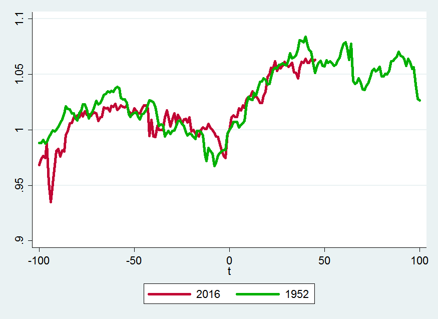
The behavior of S&P 500 around the 2016 election so far seems to be most similar to its behavior around the Clinton and Eisenhower elections in 1992 and 1952 respectively.
The similarity between the Obama and Bush elections over this truncated period is also noteworthy.
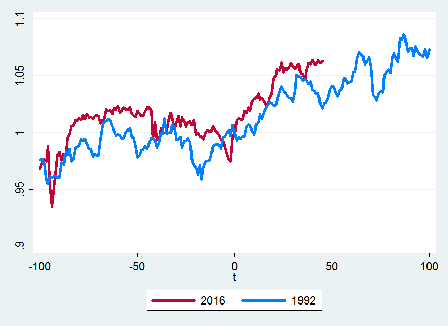
So what does the near future hold? Let’s look at how the Clinton and Trump elections compare:
If you believe the future is going to be similar to what happened in 1993, it looks like S&P 500 is going to keep on climbing.
If you believe the future is going to resemble what happened after Eisenhower’s election, it looks like S&P 500 is going start falling soon, but will still be up by about 3% 100 days from the election.
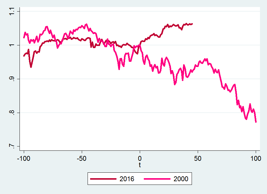
Finally, let’s compare what’s been happening around the 2016 election to what happened around the election of G.W. Bush in 2000 which is the series that is most dissimilar to the stock market behavior so far:
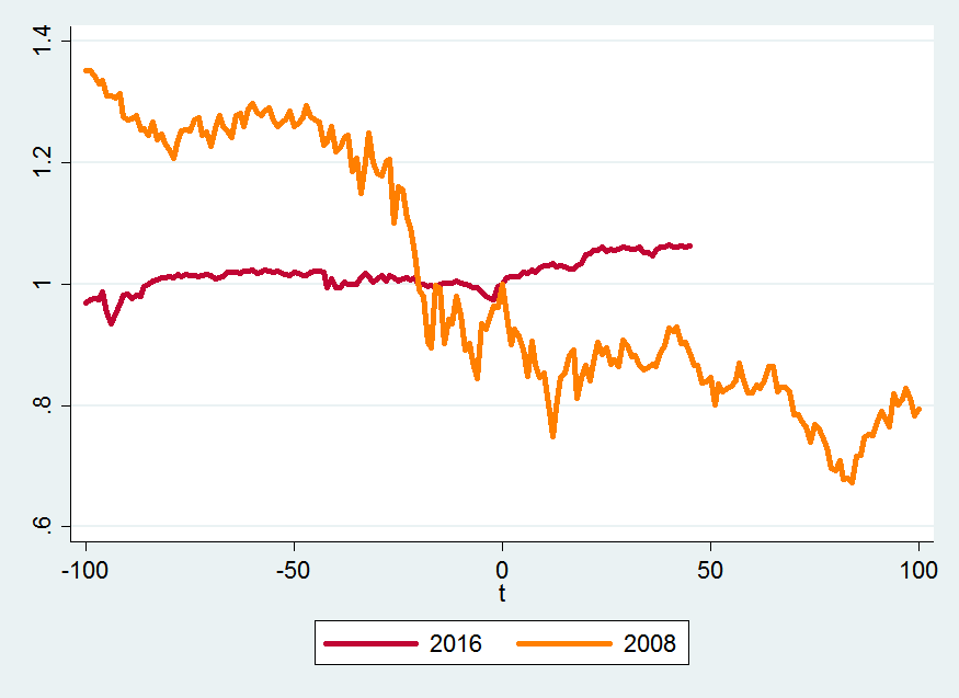
And, for completeness, here is the comparison to President Obama’s election:
We’ll see what the future holds.
Here is to hoping that there is no 20% drop in the S&P 500 in the near future.
